Paws ‘n’ Play
A Denver based natural pet food and supply store.
Reviews consistently comment on the amazing in-store experience, while the same is not mentioned for the online shopping experience.
Deliverable: Mid-Fidelity Prototype
Timeline: 2 weeks
Team: Solo Project, 1 UX Researcher/Designer
Tools: Figma, FigJam, Optimal Workshop Card Sort
Challenge
Select an eCommerce website that could benefit from an improved user experience and create mid-fidelity wireframes to showcase a solution.
Process
Help Paws ‘n’ Play level up their online experience to match the exceptional in-store version. Research how pet owners shop for staples (food) vs. novel items (toys) and intuitively categorize products.
Result
A website that leverages intuitive navigation allowing pet owners to easily find staple items as well as browse and discover novel products, therefore reducing frustration and excessive scrolling through effective filtering.


What do pet owners browsing habits look like? And how can we leverage that knowledge to improve their shopping experience?
Pet owners generally shop for essential items first, like pet food and litter, then browse for non-essential items like toys and treats.
Pace of shopping differed based on what pet owners were shopping for. Essential items need to be easily and quickly located while non-essential items are perused in a leisurely manner.
These findings meant I needed to design a site that supported both shopping habits. Products needed to be intuitively organized and easily filtered to offer the utmost convenience to those shopping for essentials, while also recreating the feeling of wandering aisles and organically finding a new toy or treat that might just edge out your pets existing favorite item.
By facilitating both shopping experiences, Paws ‘n’ Play will be able to effectively and consistently meet their customers needs regardless of what items they are looking for.
I conducted user interviews to learn how pet owners shop for their pets and synthesized the data using an affinity map.
I conducted 4 user interviews with cat and dog owners and learned that:
Products are divided into two main categories, essential (ex. food, litter) and non-essential items (ex. treats and toys).
Essential items need to be easily and quickly located while non-essential items are enjoyably browsed for when time is not a constraint.
Pet owners feel good when their pets are happy and well cared for, so they are generally willing to put in the extra effort to find those favorite items for their pets, however they will gravitate toward convenient shopping options such as big box pet stores with predictable store layouts or online stores that save past orders and make smart product suggestions.
Penny is the general embodiment of Paws ‘n’ Play’s customer base. Creating this user helped keep me anchored to our problem space, solutions, and goals throughout the project.
Pet Person Penny
Age: 28
Education: Bachelors of Science
Status: Single
Location: Denver, Colorado
Occupation: Nurse
Biography

“Essential items first, then I’ll check out fun and new things”
-Direct user interview quote
Penny loves to spend her free time exploring everything from trails to new coffee hangouts with her spunky dog, Pippa.
Behaviors
Goals
Maintaining Pippa’s health and enriching her life with fun and novel toys.
Get in and out of the store on adventure packed days.
Not being able to find her trusted go-to products quickly.
Pippa becoming bored with her current toys.
Frustrations
Knows exactly what dog food she will buy Pippa down to brand/size/flavor.
Likes to imagine or “daydream” what toys Pippa will get excited about while browsing aisles.
I conducted usability tests and a heuristic evaluation on the existing site to uncover pet owner pain points.
I ran 4 site usability tests using Paws ‘n’ Play’s current website. Participants were asked to find a red, medium-sized dog collar without using the search bar and add some treats to your cart before checking out.
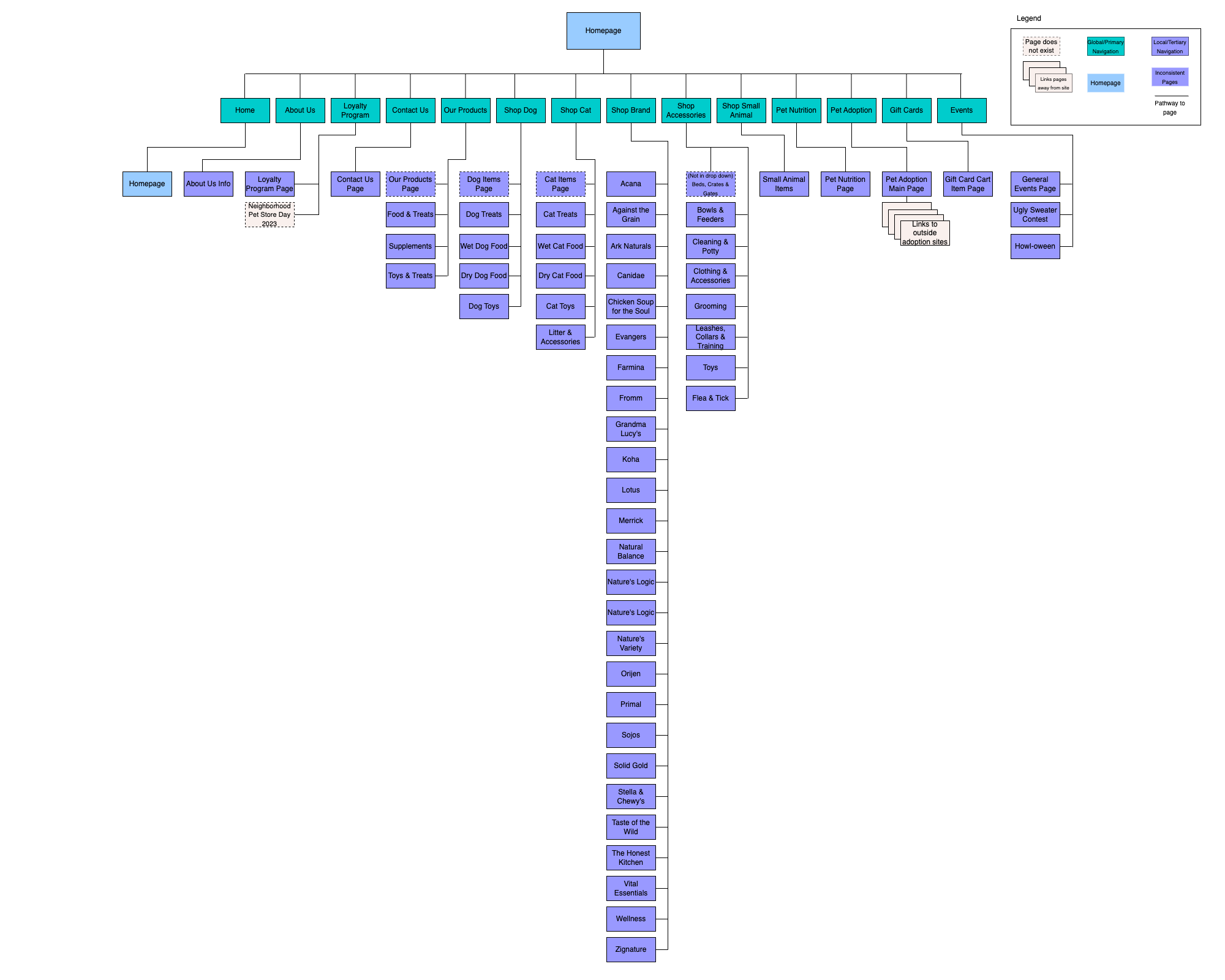
The global navigation tabs were categorized unintuitively and forced participants to read through all options before finding a subcategory called “Leashes, Collars, & Training”.
All participants were surprised to find zero filtering options and resorted to scrolling through the entire selection of leashes and collars for both dogs and cats in order to find the red, medium-sized dog collar as asked.
Every participant was frustrated by the useless sort option and reading through wordy product descriptions.
The Paws ‘n’ Play existing site heuristic evaluation to the left is representative of the issues that the usability test participants encountered while attempting to navigate the site. Efficiency related issues account for nearly 55% of the total violations.
Incorrectly anticipated dog collars to be listed under “Shop Dog”.
4/4
Were able to locate a red dog collar without frustration.
0/4
I created a journey map to further empathize with Penny and better understand what pet owners are feeling during their entire shopping experience.

Direct user interview quotes above and below
“If I wasn't looking for an exact item I would have definitely clicked out. I don't have that kind of patience.”
The user research gathered through affinity mapping, site heuristics, and journey mapping positioned me to brainstorm ways to alleviate pain points for future customers.
The three “how might we” statements below represent my research determined approach to strategically redesign Paws ‘n’ Play’s website. All statements were developed with Penny in mind.
User Research
Product categories are unclear, users unsure where to locate items
Frustrating and time consuming amounts of scrolling to find suitable items
Pet Owners enjoy wandering aisles and naturally finding new toys and treats

How Might We…
Restructure the global navigation to allow pet owners to naturally guide themselves to products?
Organize and filter products in a way enables pet owners to quickly find essentials and easily browse for novel items?
Support pet owners to discover or organically stumble upon new and relevant products?
Solution
Conduct a card sort of products to ensure navigation is intuitive
Research applicable filter options and test to confirm effectiveness
Research how to make appropriate item suggestions and simulate browsing opportunities
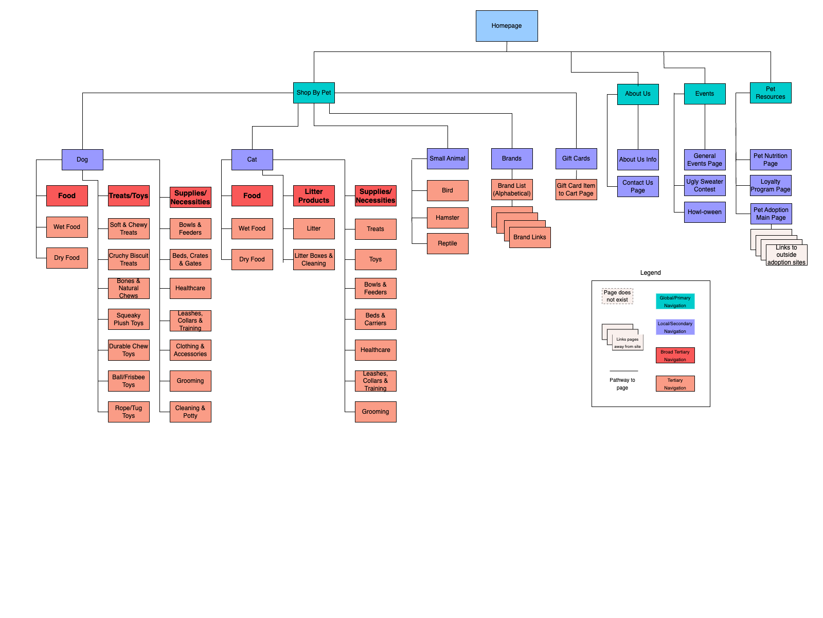
First, I utilized an open card sort and had participants categorize and label groupings themselves.
Card Sort Findings:
5 users participated in an open sort using Optimal Workshop with 80 cards.
100% users categorized products by type of animal.
50% of participants mentioned trying to imagine the physical layout of a pet store while sorting.

I was able to create a new site map and include intuitive global navigation using the data from the card sort.
Existing Site Map
Proposed Site Map
I conducted additional research through a C&C analysis to address the pain points around intuitive navigation, filtering items, and creating natural browsing opportunities.
This extra research or “window shopping” allowed me to gain inspiration on what other companies were doing well and to see where I could make improvements to stand out from the rest.
Competitors within the
Pet Supply Industry

Why these companies?

Large e-commerce sites that offer wide selections of various items.
Customers could either be looking for an exact product or need to browse for an unknown item.
Comparators outside the
Pet Supply Industry

Sound Practices:
Chewy: Concise, intuitive global navigation.
Sephora and Chewy: Organized item categories that offer useful filter options.
Home Depot: Smart, relevant item suggestions that are easily browsed.


With my redesign strategy in place, I began sketching out initial wireframes with pen and paper before moving into Figma.
Sketches of Initial Wireframes
Usability Testing Takeaways:
Early versions of the global navigation drop down menu were too wordy and redundant, I needed to be more concise.
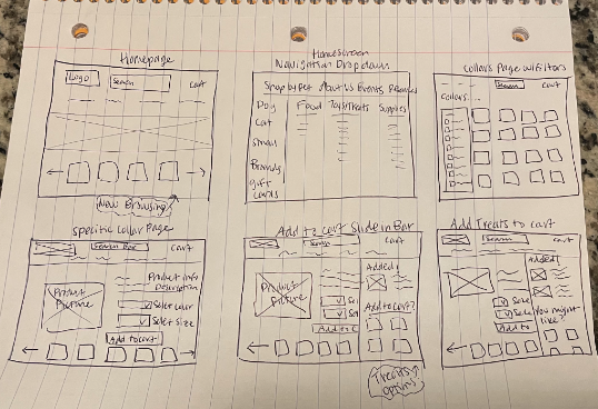
Homepage Low-Fidelity Wireframe

Product Page Low-Fidelity Wireframe
I upped the fidelity after receiving feedback from a few usability tests.
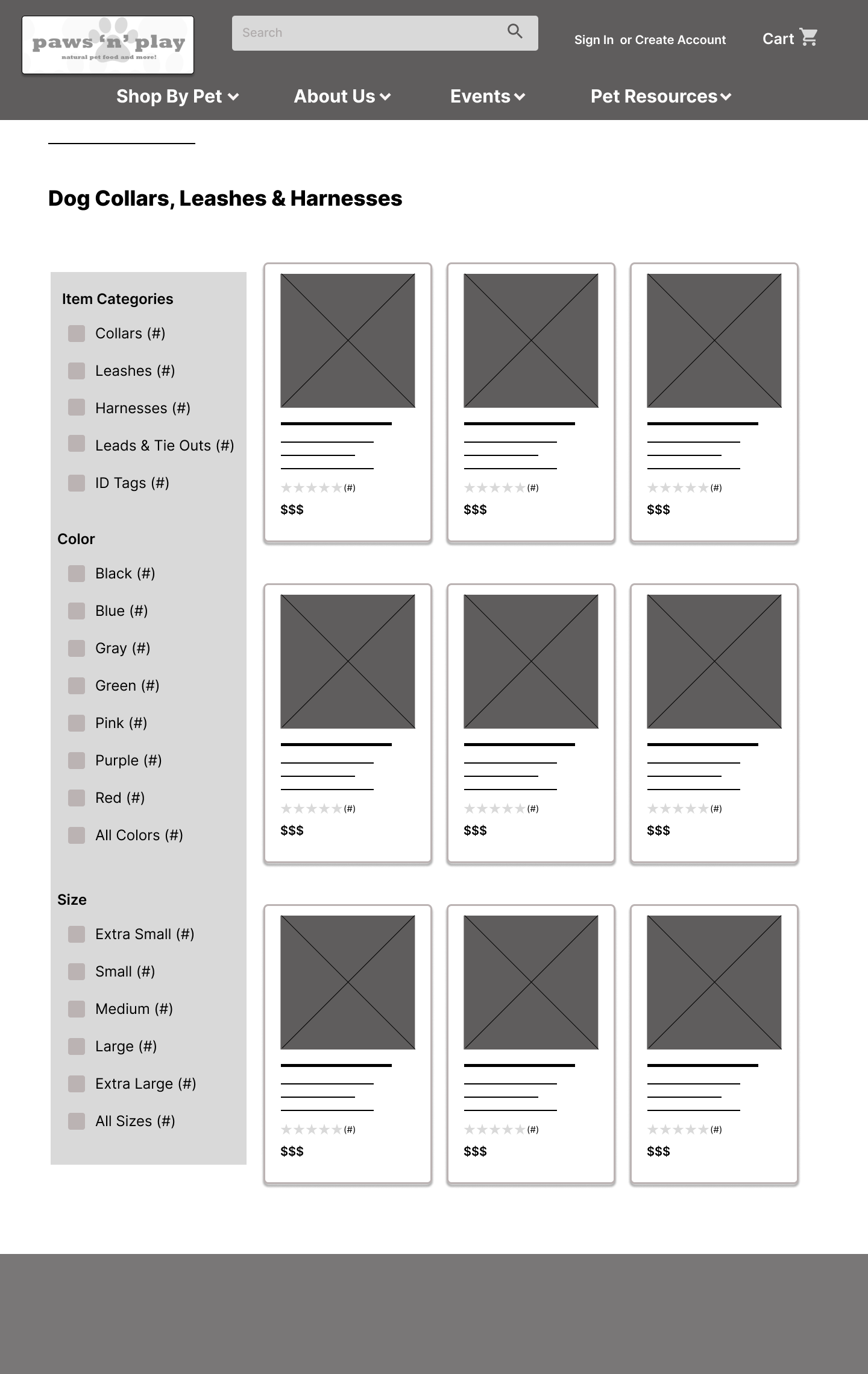
User Task: Participants were asked to find a red, medium-sized dog collar without using the search bar and add some treats to your cart before checking out.

a.
Lo-Fidelity Wireframe
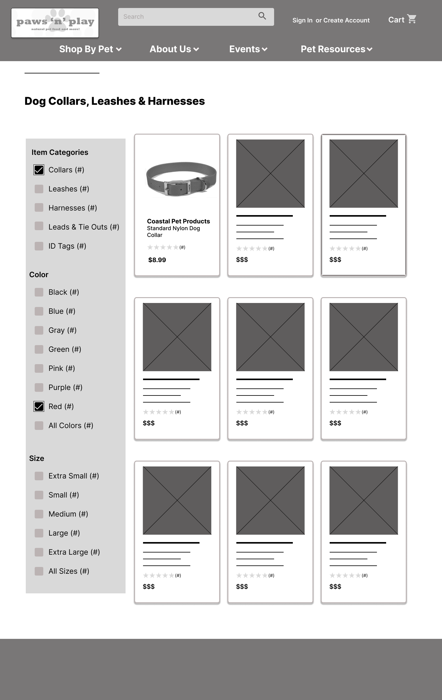
a. Removed duplicative text, ex. Dog Bowls & Feeders
b. Added more specific item categories to the filter options, ex. ID Tags
b.
Mid-Fidelity Wireframe

c. Streamlined the checkout page, allowing all entry fields to be reviewed before placing an order.
c.
High-Fidelity Wireframe
Prototype:
Retrospective
Overview
This was my first UX project and I learned a lot. While I knew that creating a website that is seamless and enjoyable to use is difficult, I was able to realize how it's more of a subtle art. Usability tests were fascinating and probably my favorite part of the process. Receiving feedback on how you intended a design to be understood versus how it was actually perceived was endlessly interesting. The research phase was also satisfying. Putting in the work to synthesize the data and allowing yourself to be curious enough to follow the “breadcrumbs” of evidence was intriguing to see how problem statements, common themes and, solutions seemed to appear out of a pile of data.
Project Takeaways
If time allowed, we would have liked to address the following:
The importance of staying open minded and not getting attached to ideas or designs.
The pros of being excessively curious and asking “why” more than you think you should in user interviews and usability testing.
Creating a compelling storyline and telling it in a captivating way.
Next Steps
Continue to test, iterate, and bump up designs to high-fidelity levels.
Design interactions in Figma so that the main menu is dynamic, give filters the ability to expand when needed and collapse when not applicable (allowing for more product browsing space), animate suggested item carousels to scroll slowly to simulate customers wandering down aisles.
Collaborate with a developer to see the designs come to life, ensure I am designing feasible solutions, and further hone good design handoff practices.