Dyrt
a smart, innovative food waste management service for businesses and municipalities.
Deliverable: Hi-Fidelity Prototype
Timeline: 3 Weeks
Team: 3 UX Researchers/Designers
My Role: Lead Researcher
Tools: Figma, FigJam, draw.io, Asana
Challenge
Help take the Dyrt website from a few disorganized pages nested within each other to a clearly articulated site that confidently presents Dyrt as the leading service provider for food waste management.
Solution
Conduct extensive research to determine what factors (cost, convenience, reliability, and others) businesses and municipalities want from their food waste service provider.
Results
A comprehensive site design that utilizes intuitive information architecture and concisely presents products and services in a manner that is highly solution-focused.

Methods for the Solution
Research the Problem Space

Stakeholder + User Interviews
Define the Problem

Affinity Mapping + Market Research + Persona
Iterative Design

Wireframes + Usability Testing
Deliver

Stakeholder Meetings + Finalized Prototype
We needed to find out what Dyrt’s current and potential customers are looking for from their food waste management service.
We conducted 5 user interviews and 5 site usability tests.
Customers perceive food waste management processes as unnecessarily complicated and arduous.
Dyrt’s current customers composted primarily because it made them feel good or proud.
Dyrt’s much larger potential customer base, however, needed to compost because they have to in order to avoid fines.
Our path forward was clear:
Design for the more difficult customer demographic, those who have to find a food waste service, as this would still serve the customers that want to compost.
What’s the best way to design a site for a customer that might not want to be there?

Using common themes found through affinity mapping, we brainstormed how we might best address pain points and reshape negative user emotions.
User Research
Confused About Products & Services
Feels Hopeless About Scale of Impact
Stressed by Difficult Navigation

How Might We…
Instill Trust?
Inspire Hope and Excitement?
Create Confidence?
Solution
Transparent & Concise Information
Digestible & Solution-Focused With Actionable Steps
Intuitive Content Organization
Oliver is the persona of Dyrt’s largest customer base. We created this user to help keep our team anchored to our problem space, solutions, and goals before moving to the design phase.
Overwhelmed Oliver
Cafe Owner | Culver City, CA

“Ugh. Another thing for the to-do list…”
Several months into owning a cafe, Oliver is delivered a government notice regarding a new food waste management mandate that could result in fines for business owners.
Already overwhelmed from wearing many hats, Oliver is flustered by this additional stressor and asks his network for their food waste management solutions, who introduces him to Dyrt.
Direct quotes from user interviews
Behaviors
Questions impact of composting
“My drop-in-the-ocean will not create waves in the eco-footprint.”

Business success comes first “Composting and waste management is not at top of priority.”

Goals
Avoid fines & comply with regulation. “It’s crazy how much it costs to throw things away. Your margins are razor thin.”

Needs accurate product information “Unsure where I’d put the bin at the restaurant.”

Frustrations
Reliable composting services "Sometimes compost trucks don’t come to pick up the waste.”

Lack of adherence from staff members “People throw the wrong types of sh*t in there.”

Pre-Project Dyrt Website
Problem: original website created more questions than it answered.

0/5
Of users were able to infer the product dimensions on the original website (i.e unsure of size, indoor vs. outdoor location, what it was made out of).
0/5
Users could freely navigate the site and resorted to stumbling upon info (i.e lack of global navigation).

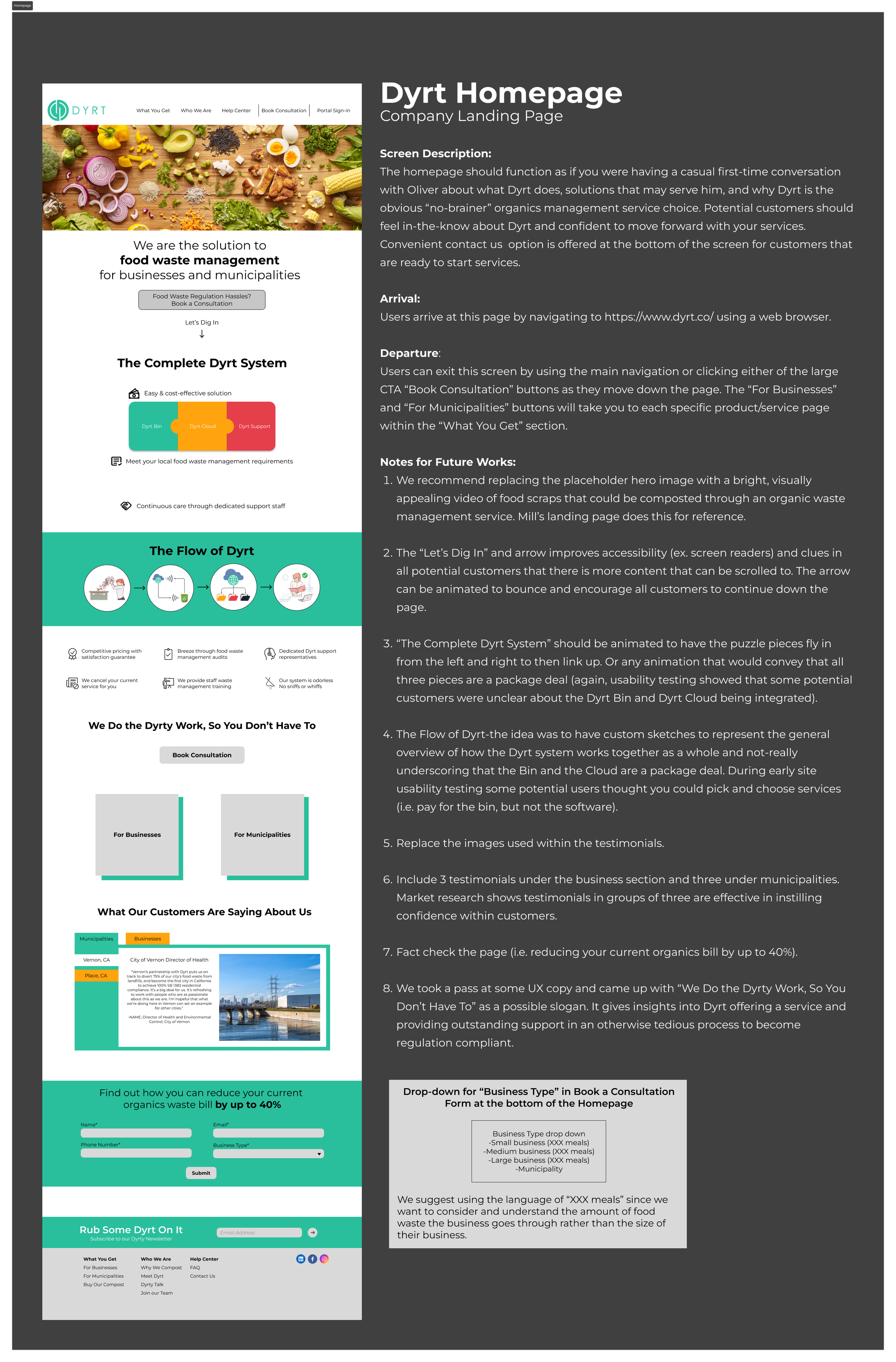
The bouncing “Let’s Dig In” arrow builds a friendly brand connection, improves site accessibility, and lets customers know there is more information.
Clear CTA offering an easy, happy path to a composting solution. Reducing overwhelm for customers like Oliver with long to-do lists.
Design Pillars:
Figma Designs
Transparent & Concise Information
Digestible & Solution-Focused Actionable Steps
Intuitive Content Organization
Transparent and concise information about Dyrt’s services for customers that need additional reasoning to sign-up before scrolling to the next CTA.
Animated puzzle pieces to fly in to connection, helping customers gain product and service understanding. It’s the first step to building confidence in Dyrt’s services.
Stakeholder Management

Established clear project goals, expectations, and success criteria at the start of the project.


Created stakeholder buy-in during the first presentation and was granted approval to build for a different user demographic based on research findings.
Design Handoff

Dyrt’s Style Guide
Maintained consistent communication and workflow with project stakeholders.

Frame Spacing
Detailed Annotations Provided to Client
Final Prototype:
Retrospective
Overview
Given the time frame of a three week sprint, we were very pleased with our results. The Dyrt website redesign rested heavily on the extensive research we synthesized. Discovering that Dyrt’s user base wasn’t cleanly split into businesses and municipalities as previously believed was crucial to our design approach. It not only allowed us to reach a larger customer base, but helped us target a site build that emphasized conventional, intuitive content organization, concisely presents products and services in a manner that is highly solution focused. I believe that the redesign will significantly help Dyrt convert a high percentage of site traffic to paying customers.
Project Takeaways
The importance of sound research and taking the time to solidify each step before moving on.

The joys of working within a dynamic team, collaboration of ideas, and learning from each others strengths. Asana, Google Suite, and Figma enabled us to work in tandem and divide and conquer parts of this project.
Effectively prioritizing goals in order to honor timelines is key.
Next Steps
If time allowed, we would have liked to address the following:
Continue to test and iterate on the initial conversation homepage format.
Dyrt Cloud Software prototype with an on-boarding walkthrough available on the website.
Add a page for City-specific links to regulation for customer reference.
Include images and videos of products rather than renderings.
Obtain site analytics once the redesigned website is complete and live.